Image, with motion.
 See the image ad ↗
No video needed. The scene stays still while dust and a measured text build bring it to life.
See the film ad ↗




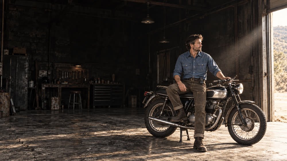
The bike is what you notice first. Then the garage, the light, the clothes. We wanted the scene to feel like an afternoon you'd like to have, with Red Clouds already part of it.
High contrast and worn surfaces connect the film to the brand's motorcycle and maker roots. Slow text entrances give the scene time to breathe. The product details arrive once there's a reason to care about them.
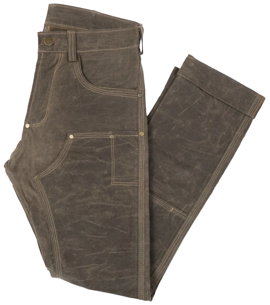
When the rider leaves, the empty garage holds. The pants slide into that space with their name, construction details and offer. Product hotspots let someone inspect the shirt and sheath without leaving the scene.
Original product cutouts keep the details accurate. The slow movements and stitched buttons carry some of the clothing's texture into the page.
Try the landing page ↗The HTML banners work with or without video. The image version builds the headline, logo and offer over drifting dust. The film version lets the rider leave before the invitation appears.
See the image ad ↗No video needed. The scene stays still while dust and a measured text build bring it to life.
See the film ad ↗Email keeps the offer and products close to the top. Readers can enter the campaign or go straight to the item they want.
See the email ↗The ad and email open the door. The landing page continues the story, then puts the product within reach. Each item links to its Red Clouds listing for sizing and purchase.
Back to the complete experience ↗